
In full disclosure, this is a free copy that is available to everyone. So, it’s not PR, nor was it gifted.
I like to put that out there first to avoid any legal issues in the future.
I follow a LOT of indie comic creators, and the list is growing everyday. I find myself intrigued at the stories they are weaving and the artwork they produce.
I can’t wait until I have a stable home and can start a physical collection, but enough of that, let’s get onto the review.
Background:
Click on the link in his Twitter bio, you get link that goes nowhere. In all fairness, I told him the link in the description of one of his videos was broken, and he was more than happy to furnish me with this link.
Gumroad.com/drawandtalk
This is his Twitter.
He even has a YouTube.
There is no world-building on the site, just a listing of other projects. Not everyone does world building across platforms. I will NOT knock him for that.
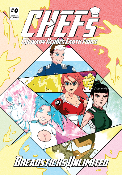
Chefs is a cheeky take on the superhero genre. It has its own cast of characters, and amazingly enough, it is all done by one man.
As an independent and self-publishing author, I can tell you that writing, editing, finding affordable cover art and marketing a novel is hard for one person, but when you add line art and coloring on top of that, I would imagine the job becomes enormous in proportion to mine.
The line work and coloring

The line art, coloring and overall style remind me of old Jughead and Archie comics, the ones you bought on the rack in supermarkets. Yes, I am that old. It is good, but tends to change throughout the book. The coloring has the same problem. It’s vibrant in some panels but looks washed out in others, especially with the light-skinned characters.
There are some characters with pointed chins and some with rounded ones. This may have been done on purpose, but it feels incongruent.
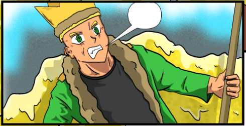
The shading needs a little work as I could not tell where the light source was in some panels. Take the one above for instance. At first glance, it would like the light is from above, but if that is the case, why is there a shadow cast behind the villain onto the monster?
The lettering
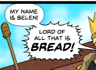
The spacing is inconsistent. The kerning is fine between the letters, but the spaces between the words can me more uniform.
An Example:
Where it’s fine when he introduces himself, and the words “Lord of” but the words “all that” is too far part. the last two words could be a little closer together.
(I know. I am nit-picky. Sue me.)
Character introductions and models
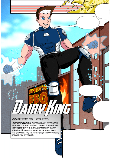
This triggered memories of the hero cards in old comics and cartoons. I like this style. It’s a wonderfully stylized way to say, “This is our hero and what they can do.”
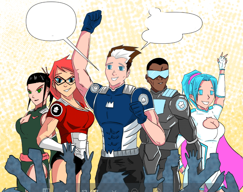
Each color palette and character model is unique to the character and their powers.
The Story
It doesn’t take itself too seriously, but there are times you can see conflict between the heroes. The Dairy King looks to me the main one giving the rest of the team strife by going off on his own. It starts out episodic with an underlying theme.
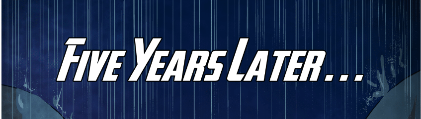
Then, when you think it’s going to stay light-hearted, it story flips on its ear with a timeskip.
Now, now, I am not going to give away the whole thing.
Over all, it was an enjoyable read, but still seems rough with the story and artwork, but you do have to take into consideration one person is doing it all.
I give Chefs: Culinary Heroes Earth Force Issue #0

3 out of 5 shots
Discover more from House of Geek
Subscribe to get the latest posts sent to your email.
