
I was approached by the writer of this comic to review the two volumes his team has produced. I purchased both volumes. After reading and going over the lettering and art, here is the review.

This volume had a team of three people. The first thing I noticed was the lack of an editor for the writing. I know some creators outsource the editing, but after reading the dialogue and narrative boxes, I fear they may have skipped the editing process.
The Story
The origin story is solid. I did have to re-read parts to get a better picture of what was happening, but that is of no consequence. It’s not a bad origin of the birth of a hero. However, the dialogue could be cumbersome and feels forced in some places. It seems as if the writer wanted to show his extensive vocabulary.
The Artwork

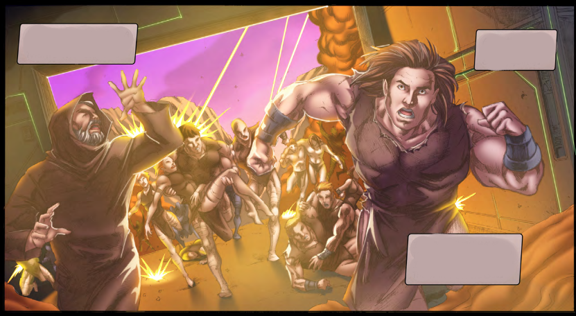
The lighting and shading were inconsistent. Though there were panels with excellent detail, other panels looked washed out and blurry like the one above. The linework and detailing of prominent character models in some panels go from very detailed to having little to no detail at all.
Some of the colors chosen were well done. Other choices made the panels look muddy and washed out.
The Lettering


My calligrapher side constantly shook its head at the font choices and the colors chosen to highlight the lettering. The Old English text for Raknirod was a poor choice as the font is hard to read in the best of situations. The font chosen for the narrative boxes was also hard to read. The contrast used for the dialogue and narrative boxes could have been better as well.
The Rating
The overall story isn’t bad, but the dialogue can be a turn-off. The artwork can be tough to look at in places. The font choices could be better. I give this volume a 2 out of 5 espresso shots.

Until next time,
Anissa “Maddy” Walker
Discover more from House of Geek
Subscribe to get the latest posts sent to your email.
