
This is the second book from Phoenix Press. This one I paid to read.
Their first, 2100 Samurai, was reviewed on this blog some time ago, the first volume.
This is a decidedly different story from the samurai saga, but is it one worthy of being read?
That is what I asked myself as I dove into its contents.
There is a team behind this one, each with their own talent.
You can keep up with Phoenix Press here.
The Story…
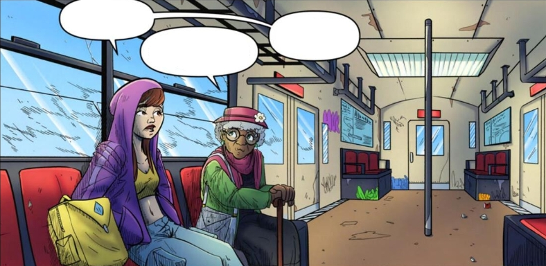
The story sets up how close she and her father are in their relationship before the framing which allows us to understand why she would do this. It is refreshing to see a father/daughter bond that is positive.
This flows into the future where she doesn’t understand how her father could have made the choices that led him to being framed.
This is an origin story with a firm set-up and quick delivery. We go from her visiting her father to her teaming up with a comrade of her father’s to start her hero’s journey.
We see her learn about her father’s past and even embark on her first mission.
It felt a bit rushed, but it flowed well for having exposition, set-up, and a first mission.
This is a good foundation.
Artwork…
Linework:
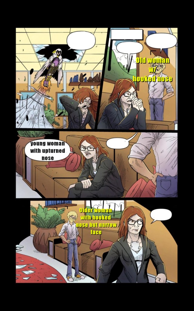
The linework I found consistent in MOST places except for some of the characters. The features tended to change, albeit subtlety. The only glaring change was the page to the left where the antagonist seemed to de-age and age from one panel to another.
This is jarring. I had to look at this page several times to make sure I wasn’t seeing things.
The line work on the backgrounds and scenery was done very well. I got a good feeling of depth and detail in each panel.

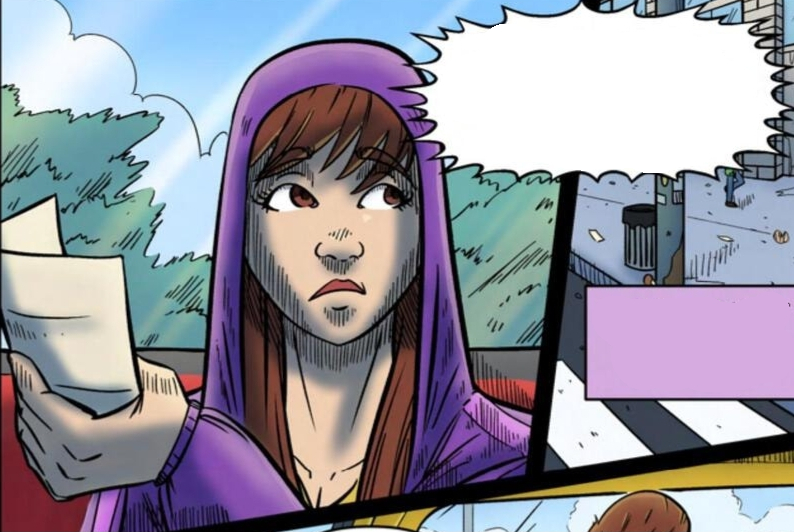
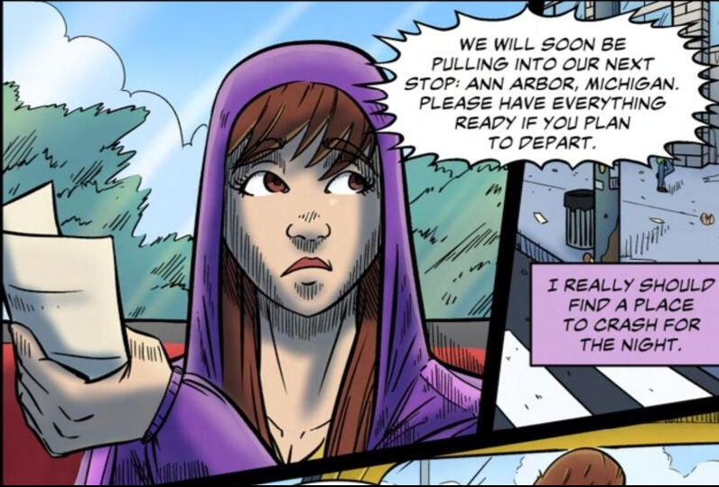
There were a couple of instances where the poses looked unnatural and disjointed. Where she was holding the paper is an example.
Coloring and Shading…
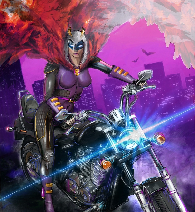
Both were done VERY well. I love how the colorist knew how the light worked and painted each scene beautifully. They even used color to set the mood and define each character. In the scene on the right, you can see some foreshadowing with the protagonist’s color palette.
The shading is not done heavily, and that compliments the art style, which isn’t harsh but full of detail.
Lettering…
There are a couple of instances where the lettering height is inconsistent, but it wasn’t enough to take me out of the story as a whole. The spacing and kerning were on point.
The Rating…

Screecher Vol. 1 gets 3.5 out of 5 espresso shots. Though the story was a solid beginning, it did feel rushed, and some of the line work could have been better.
It is worth the read, however. Don’t get me wrong on that. They have a good start. I am curious to see how the story unfolds.
Until next time,
Anissa “Maddy” Walker
Discover more from House of Geek
Subscribe to get the latest posts sent to your email.
